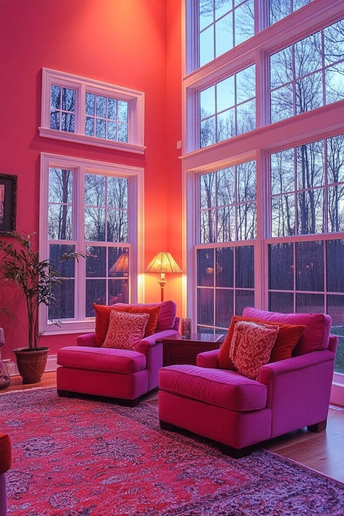
Can pink really work in a living room without feeling over-the-top? Absolutely! Pink is more versatile than you might think—it can be soft and calming, bold and vibrant, or somewhere perfectly in between. Whether you’re looking to add a playful pop of color or embrace a full-on rosy retreat, these 29 pink living room ideas will help you create a space that’s bright, stylish, and full of personality. Ready to think pink and give your living room a cheerful twist? Let’s dive in and get inspired!
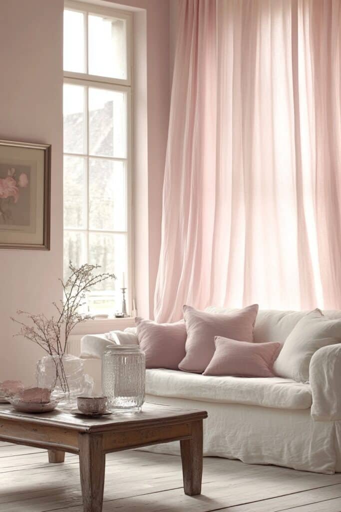
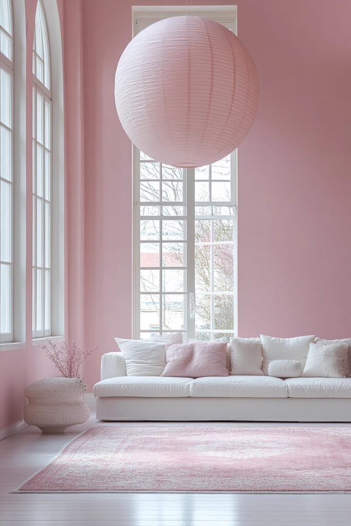
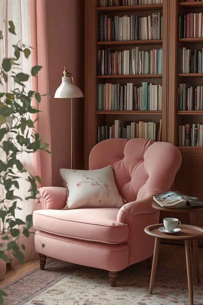
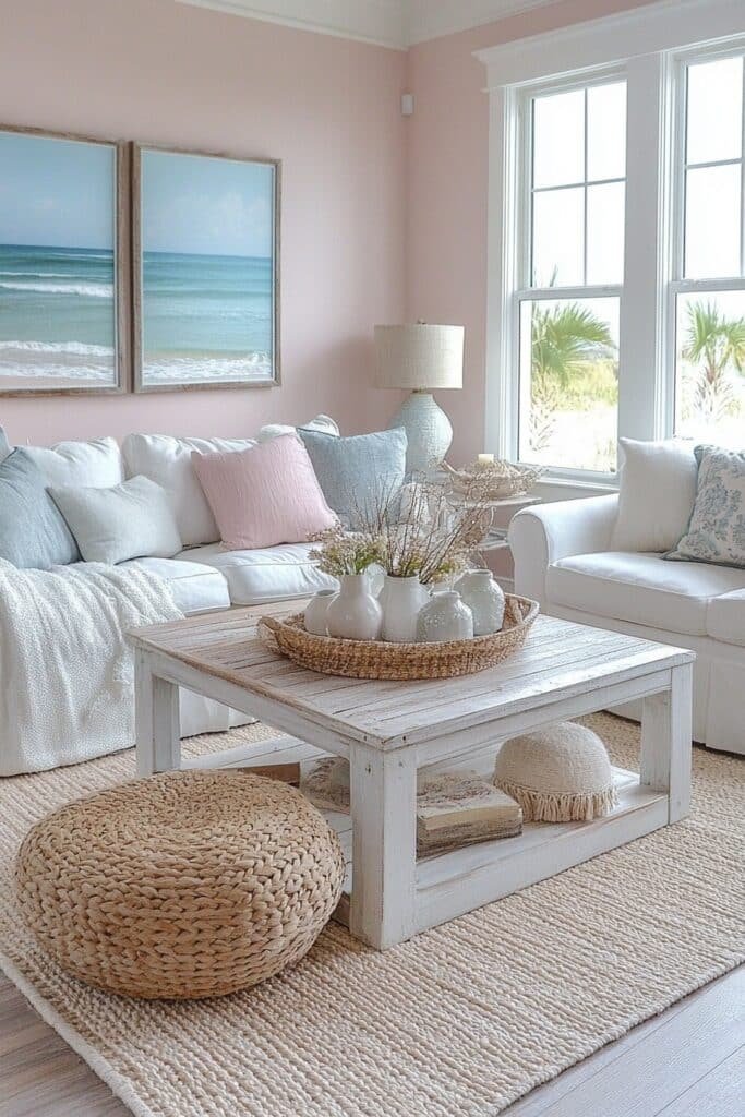
1. Pastel Pink Oasis
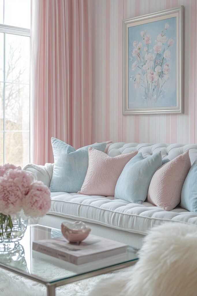
A Pastel Pink Oasis living room features soft pink tones to create a serene and airy atmosphere. This tranquil design blends pastel walls with neutral accents and plush furnishings, perfect for relaxing.
🎨 Steal This Look
- Paint Color: Sherwin-Williams Intimate White SW 6322
- Furniture: curved boucle sofa in ivory, rounded velvet accent chair in blush, light oak coffee table with soft edges
- Lighting: oversized linen drum pendant with brass accents, pair of sculptural ceramic table lamps
- Materials: matte plaster walls, raw silk curtains, unbleached wool rugs, brushed brass hardware
This is the living room equivalent of a deep breath—soft, unhurried, and quietly luxurious without trying too hard.
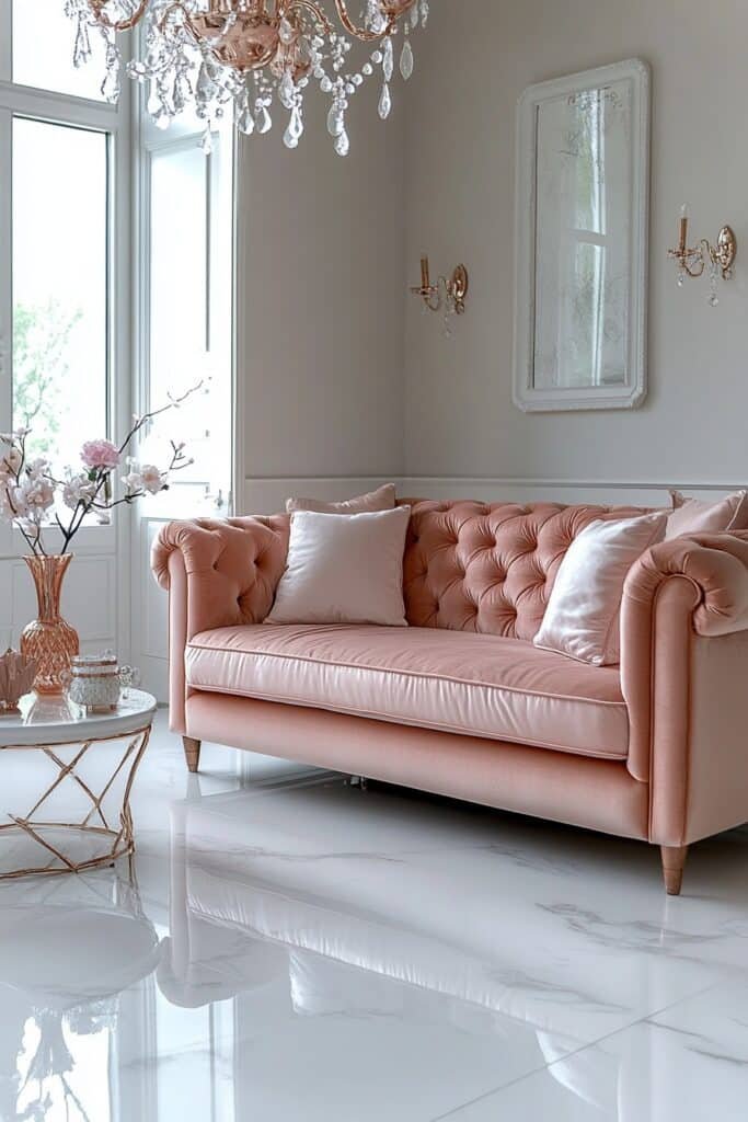
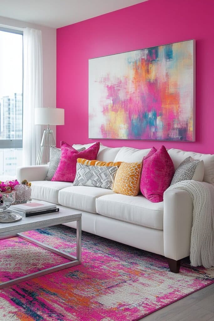
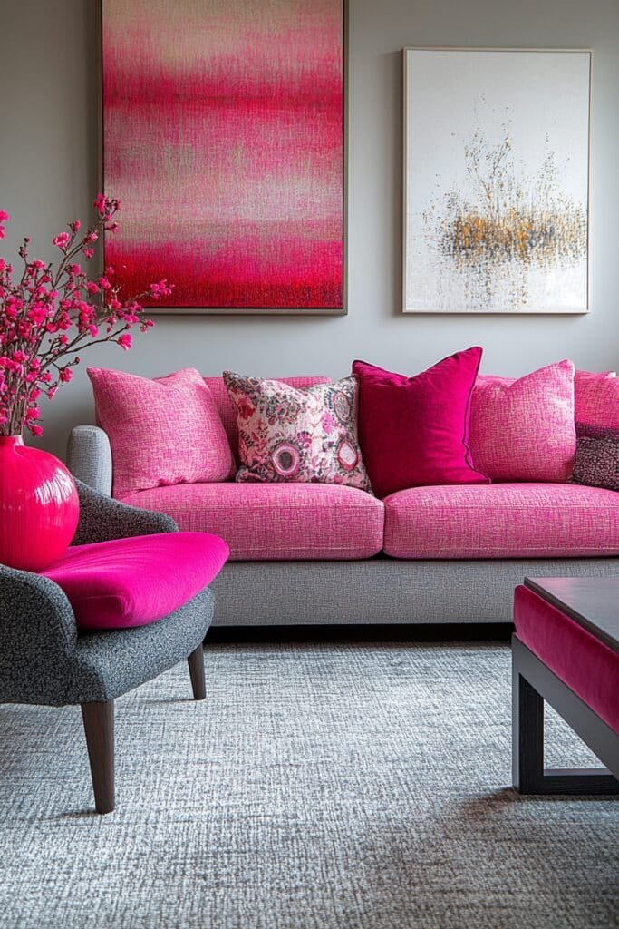
2. Vibrant Blush Inspiration
Vibrant Blush Inspiration energizes the living room with bold blush tones paired with neutral furniture for balance. Metallic accents and sleek designs add sophistication.
🌟 Steal This Look
- Paint Color: Benjamin Moore First Light 2102-70
- Furniture: Clean-lined ivory or cream sofa with tapered legs, light oak media console
- Lighting: Brushed brass arc floor lamp with white drum shade
- Materials: Matte metallics, velvet upholstery, light wood tones, glass accents
This is the pink living room for people who swore they’d never go pink—the metallic edge and crisp neutrals give it backbone without sacrificing warmth.
3. Subtle Pink Sanctuary
Subtle Pink Sanctuary uses muted pink tones to craft a peaceful living room retreat. Minimalist furniture and clean lines maintain modern elegance.
🖼 Steal This Look
- Paint Color: Farrow & Ball Pink Ground 202
- Furniture: low-profile white linen sofa, pale oak nesting coffee tables, sculptural armchair in natural canvas
- Lighting: oversized paper globe pendant, slim brass floor lamp with linen shade
- Materials: raw linen, bleached oak, unglazed ceramic, brushed brass
This is the pink for people who swore they’d never go pink—quiet enough to live with, warm enough to feel like a hug when you walk in.
4. Rose Gold Elegance
Rose Gold Elegance blends pink and rose gold accents for a chic living room. Soft fabrics and shimmering metallics ensure a luxurious feel.
✎ Steal This Look
- Paint Color: Behr Rose Gold M170-3
- Furniture: blush velvet sofa with rose gold hairpin legs, acrylic nesting coffee tables, rose gold floor mirror
- Lighting: rose gold sputnik chandelier with frosted globe bulbs
- Materials: velvet upholstery, brushed rose gold metal, marble accents, sheer blush drapery
This look feels like slipping into silk pajamas with a champagne cocktail—indulgent, feminine, and unapologetically glamorous without trying too hard.
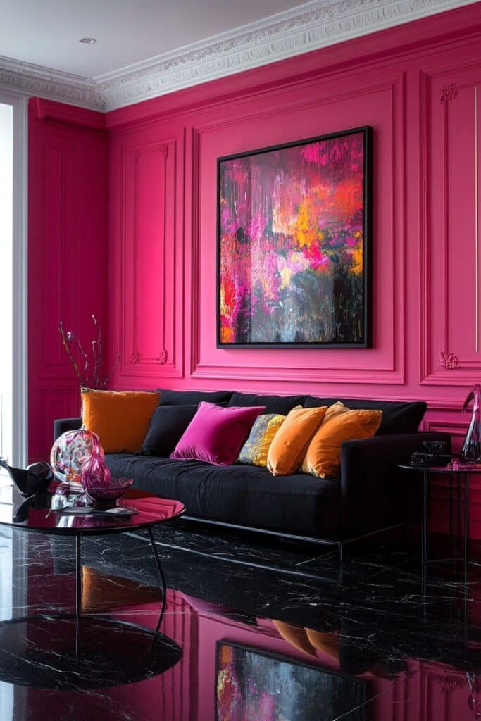
5. Magenta Energy Space
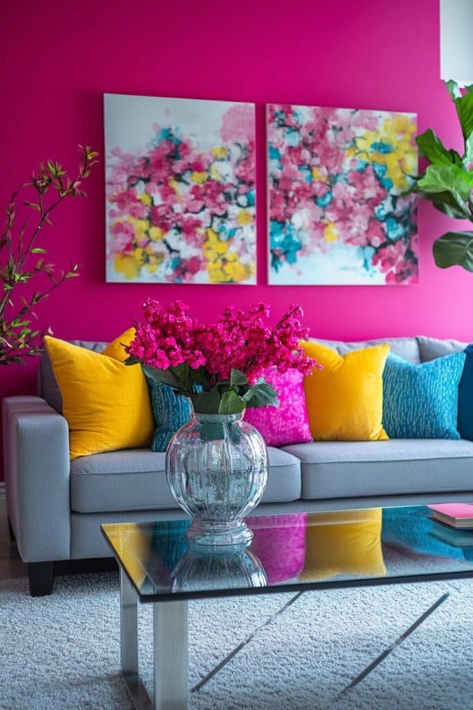
Magenta Energy Space features vibrant magenta walls and furniture for a bold statement. Pairing with navy or teal adds depth and contemporary flair.
★ Steal This Look
- Paint Color: Valspar Magenta Magic 1004-6A
- Furniture: low-profile velvet sofa in deep navy, acrylic accent chair, brass-legged coffee table
- Lighting: geometric sputnik chandelier in matte black
- Materials: velvet upholstery, polished brass, lacquered surfaces, geometric patterns
This look demands commitment—half-measures read as mistake, but full saturation feels intentionally editorial, like stepping into a fashion editor’s personal salon.
6. Coral Bliss Room
Coral Bliss decor/” data-wpil-monitor-id=”1576″>Room integrates coral pink tones with sandy neutrals for a cozy beach-inspired look. Lightweight fabrics and inviting textures create a relaxed vibe.
🖼 Steal This Look
- Paint Color: PPG Coral Reef PPG1059-4
- Furniture: low-profile linen slipcovered sofa in sandy oatmeal, whitewashed rattan accent chair, driftwood coffee table with live edge
- Lighting: oversized natural woven pendant light, ceramic table lamps with linen shades
- Materials: raw jute, bleached oak, unbleached cotton, sea grass, matte terracotta
This coral-and-sand combo feels like sunset on the shore—it’s the pink living room for people who want warmth without sweetness.
7. Neon Art Loft
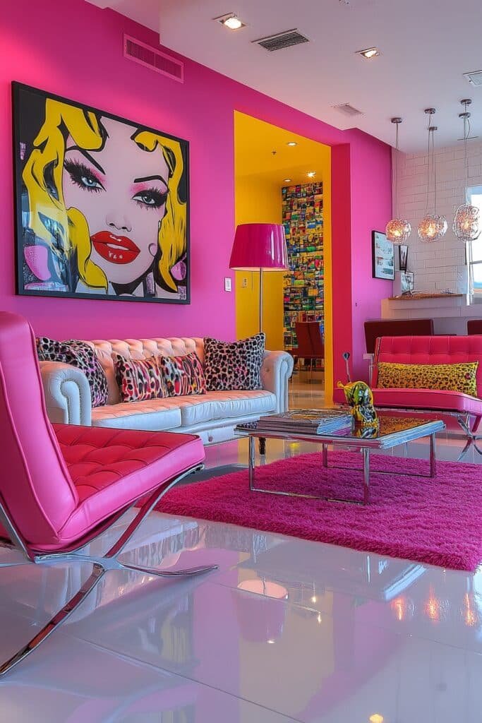
Neon Art Loft uses neon pink and pop art elements to make a striking visual statement. Black and white accents provide a modern contrast.
🌟 Steal This Look
- Paint Color: Dunn-Edwards Hot Pink DE5012 for neon accent walls, Dunn-Edwards Black DEA187 for grounding elements
- Furniture: Low-profile black leather sectional, acrylic coffee table, white lacquer media console
- Lighting: Custom neon tube art installations, matte black track lighting, exposed bulb pendant clusters
- Materials: Glossy acrylic, polished concrete floors, chrome metal frames, vinyl pop art prints
This look demands commitment; half-measures read as dorm room, so go bold with scale and let the black and white do the visual breathing.
8. Pink Minimalist Retreat
Pink Minimalist Retreat embraces soft pink hues with sparse furnishings for an uncluttered, tranquil space. Subtle grays and whites enhance serenity.
✎ Steal This Look
- Paint Color: Clare Paint Wing It PINK-05
- Furniture: low-profile white linen sofa, pale oak floating media console, single sculptural accent chair in warm gray bouclé
- Lighting: paper globe pendant with soft diffused glow
- Materials: raw oak, unbleached linen, matte ceramic, brushed brass minimal hardware
This look feels like exhaling after a long day—there’s something deeply restorative about stripping everything back to softness and light.
9. Bold Pink Delight
Bold Pink Delight combines hot pink tones with lively patterns and contrasting accents for an energetic living room.
🖼 Steal This Look
- Paint Color: Fine Paints of Europe Sash Pink 236
- Furniture: Mid-century modern sofa in crisp white bouclé, sculptural acrylic coffee table, hot pink velvet accent chairs
- Lighting: Sputnik brass chandelier with globe bulbs, pink glass table lamps with drum shades
- Materials: High-gloss lacquer, brass metallics, geometric printed textiles, white shag rug
This look is for the fearless—I’ve seen hot pink transform timid spaces into conversation starters, but it demands commitment. Own it completely or don’t go there.
10. Black and Pink Harmony
Black and Pink Harmony juxtaposes soft pink with bold black for a modern, sophisticated living room. Sleek furniture and contemporary designs elevate the look.
★ Steal This Look
- Paint Color: Backdrop Dried Rose 01-03-06 for the soft pink wall; Backdrop Black 01-01-01 for accent wall or trim
- Furniture: low-profile black leather sectional with clean lines, matte black metal coffee table, pink velvet accent chair
- Lighting: matte black geometric pendant or sputnik chandelier with warm brass interior accents
- Materials: matte black metal, pink velvet, polished concrete or dark oak flooring, brushed brass hardware
This pairing reads confidently feminine without feeling precious—the black grounds the pink and makes it feel grown-up and gallery-worthy.
11. Playful Candy Pink
Playful Candy Pink features candy floss pink tones with minimalist, futuristic furnishings for a whimsical, airy living room.
💡 Steal This Look
- Paint Color: Sherwin-Williams Pink Flamingo SW 0080
- Furniture: low-profile modular sofa in crisp white bouclé, sculptural acrylic accent chair, floating media console with rounded edges
- Lighting: oversized globe pendant in matte white, integrated LED strip cove lighting
- Materials: high-gloss lacquer, frosted acrylic, polished chrome, white terrazzo
This look walks the tightrope between sweet and sophisticated; the key is treating pink as a neutral backdrop for sculptural, gallery-worthy pieces.
12. Marble Pink Luxury
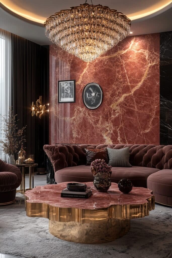
Marble Pink Luxury incorporates pink marble elements into the decor/” title=”decor” data-wpil-keyword-link=”linked” data-wpil-monitor-id=”1582″>decor for a touch of opulence. Elegant furnishings complement the textured richness.
🖼 Steal This Look
- Paint Color: Benjamin Moore First Light 2102-70
- Furniture: curved velvet sofa in blush pink, marble-top coffee table with brass base, channel-tufted accent chairs
- Lighting: cascading crystal chandelier with warm dimmable LEDs
- Materials: Calacatta Viola marble, brushed brass, silk velvet, mother-of-pearl inlay
This look whispers old-Hollywood glamour without shouting—perfect if you want feminine energy that still feels grown-up and investment-worthy.
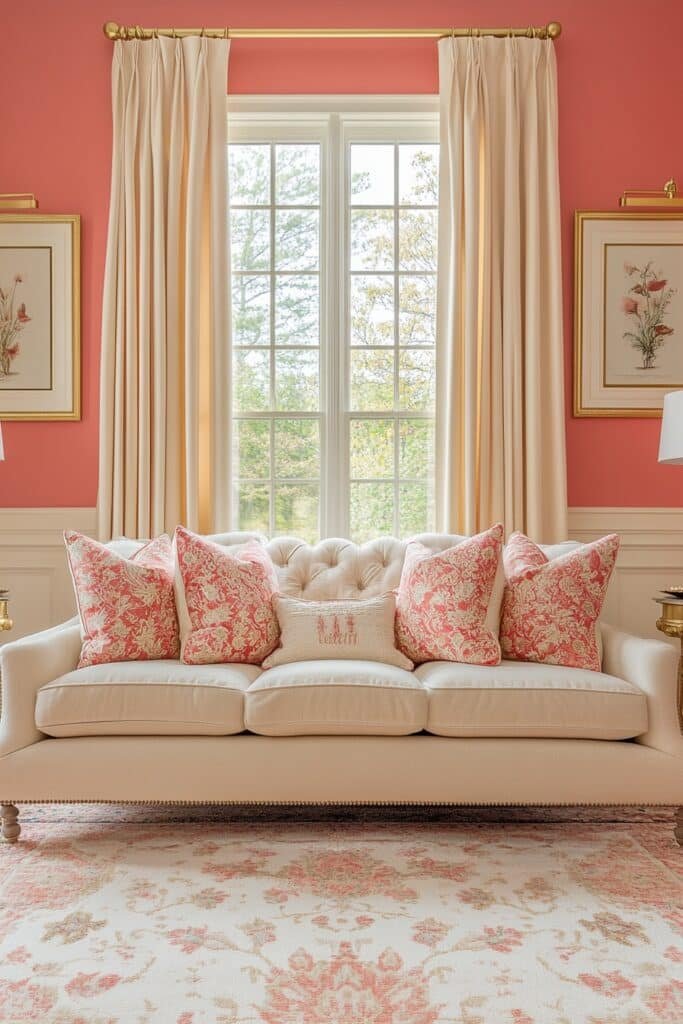
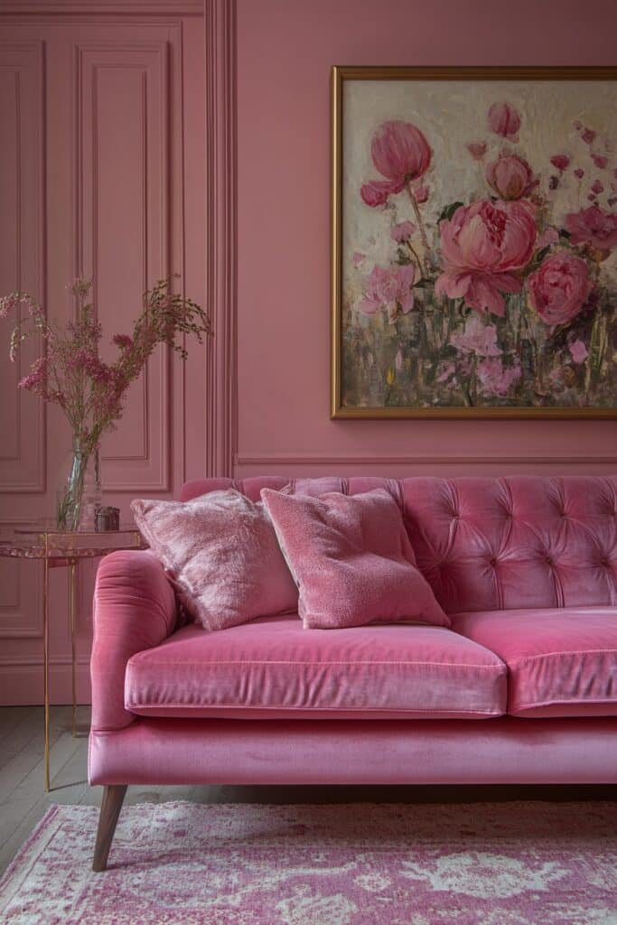
13. Romantic Rose Escape
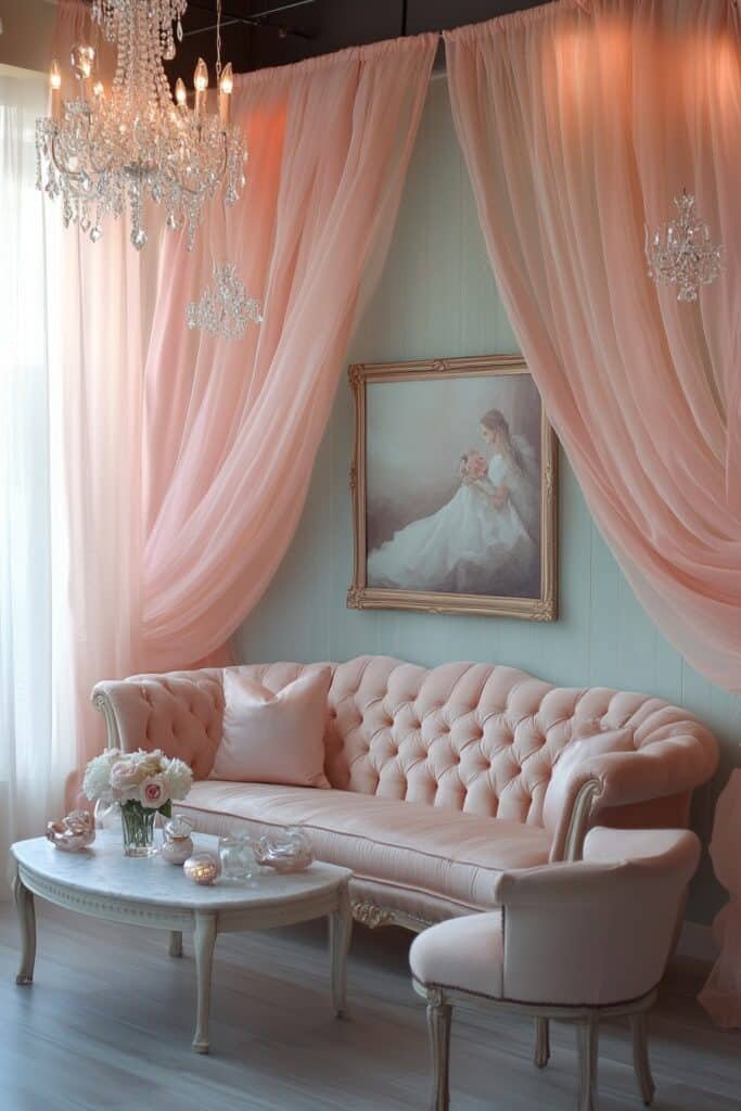
Romantic Rose Escape uses soft rose tones to create a peaceful and inviting living room. Delicate fabrics and subtle patterns enhance the romantic vibe.
✎ Steal This Look
- Paint Color: Farrow & Ball Pink Ground 202
- Furniture: curved blush velvet sofa, antique-style carved wood side tables, tufted ottoman
- Lighting: crystal chandelier with warm candle-style bulbs, brass floor lamp with silk shade
- Materials: velvet, distressed wood, antique brass, floral linen, aged mirror
This is the living room equivalent of a love letter—soft, nostalgic, and unapologetically feminine. I’ve seen this palette turn even the most skeptical partners into converts when the textures feel rich rather than precious.
14. Chevron Pink Chic
Chevron Pink Chic adds movement and energy to the living room with bold chevron patterns in pink. Neutral backdrops keep the space balanced.
🏠 Steal This Look
- Paint Color: Behr Pink Ground M160-1
- Furniture: low-profile white sofa with clean lines, acrylic accent chair
- Lighting: geometric brass pendant with exposed bulb
- Materials: chevron-patterned pink throw blanket, white shag rug, brass metal accents
This look hits that sweet spot between playful and polished—perfect if you want pink that feels grown-up, not girly.
15. Retro Satin Style
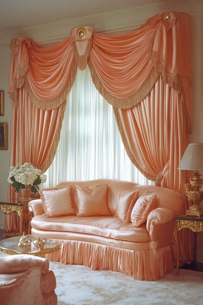
Retro Satin Style combines salmon pink satin fabrics with darker furnishings for a luxurious retro-inspired living room.
★ Steal This Look
- Paint Color: Valspar Pink Ground 1002-2C
- Furniture: salmon pink satin sofa, dark walnut credenza, black lacquer side tables
- Lighting: brass arc floor lamp with drum shade
- Materials: satin upholstery, dark wood tones, brass metallics, velvet accents
This look channels 1970s glamour without the dust—it’s the kind of room that makes you want to pour a negroni and play vinyl.
16. Velvet Pink Comfort
Velvet Pink Comfort centers around the luxurious texture of pink velvet, paired with metallic accents for a cozy, stylish living room.
🖼 Steal This Look
- Paint Color: PPG Rose Sachet 236-3
- Furniture: blush pink velvet sofa with deep channel tufting, brass-legged accent chair
- Lighting: brass globe pendant with warm dimmable glow
- Materials: crushed velvet, brushed brass, white marble, soft wool throws
There’s something instantly hug-like about sinking into pink velvet after a long day—it transforms a living room from showpiece to sanctuary.
17. Golden Blush Glam
Golden Blush Glam fuses bold pink with glittering gold for a sophisticated and luxurious living room. Sumptuous textures enhance the elegant atmosphere.
🎨 Steal This Look
- Paint Color: Dunn-Edwards Pink Ground DE5103
- Furniture: blush pink velvet sofa with gold tapered legs, gold-framed glass coffee table, cream boucle accent chair
- Lighting: gold sputnik chandelier with frosted glass globes, gold arc floor lamp with pink drum shade
- Materials: velvet, brushed gold metal, marble, mercury glass, silk
This look walks the line between playful and polished—it’s for anyone who wants their living room to feel like a jewel box without sacrificing comfort.
18. Geometric Pink Fun
Geometric Pink Fun incorporates vibrant pinks and playful geometric patterns for a lively, creative living room.
🏠 Steal This Look
- Paint Color: Clare Paint Good Vibrations CW-13
- Furniture: Clean-lined white or light wood sofa with tapered legs, geometric coffee table with hexagonal or triangular base
- Lighting: Sputnik chandelier or geometric pendant with brass or black metal arms
- Materials: Matte ceramic, woven rattan accents, velvet in geometric color blocking, brass geometric decor objects
This look channels serious Palm Springs energy—it’s for anyone who treats their living room like a creative playground rather than a stuffy showcase.
19. Fuchsia Fusion Haven
Fuchsia Fusion Haven showcases deep fuchsia tones with contrasting pops of teal or yellow for a bold, contemporary living room.
🖼 Steal This Look
- Paint Color: Fine Paints of Europe Hollands Glorie FU-012 (deep fuchsia with purple undertone)
- Furniture: Low-profile charcoal velvet sectional with clean lines, brass-accented coffee table, teal leather accent chair
- Lighting: Sputnik chandelier in matte black with gold interior, sculptural brass floor lamp
- Materials: Velvet upholstery, brushed brass, teal leather, geometric ceramic accessories, abstract art with yellow accents
This look demands confidence; the fuchsia reads as sophisticated rather than juvenile when paired with luxe materials like velvet and brass.
20. Cozy Rose Corner
Cozy Rose Corner creates a comfortable nook with soft rose pink tones, perfect for reading or relaxing.
💡 Steal This Look
- Paint Color: Backdrop Rosé Season 41-02-08
- Furniture: blush velvet loveseat with rounded arms, whitewashed oak side table, brass floor lamp with linen shade
- Lighting: warm brass arc floor lamp with drum shade
- Materials: velvet upholstery, bleached oak, brushed brass, chunky knit wool throws, linen textiles
This is the reading nook you sink into with tea and a novel—the velvet practically begs for a Sunday afternoon.
21. Modern Pink Mod
Modern Pink Mod blends pink and gray tones for a sleek and stylish living room. Minimalist furniture and pops of color add modern flair.
🌟 Steal This Look
- Paint Color: Sherwin-Williams Intuitive SW 6017
- Furniture: low-profile gray sectional sofa with clean lines, blush pink velvet accent chair, matte black metal coffee table with geometric base
- Lighting: arched matte black floor lamp with white drum shade, recessed ceiling lights
- Materials: velvet upholstery, brushed metal, light oak wood flooring, concrete or marble accent surfaces
This look reads confident and editorial—like someone who isn’t afraid of color but knows restraint is what makes it work.
22. Sunset Pink Glow
Sunset Pink Glow captures the warmth of a pink sunset with gradient tones and soft lighting for a relaxing living room.
🌟 Steal This Look
- Paint Color: Benjamin Moore First Light 2102-70
- Furniture: blush velvet sofa with rounded arms, light oak coffee table with soft curves
- Lighting: warm dimmable LED floor lamp with linen shade, string lights with rose gold wire
- Materials: velvet, bleached oak, brushed brass, sheer linen curtains
This is the room you sink into at golden hour with a book and nowhere to be—the pink wraps around you like the last ten minutes of daylight.
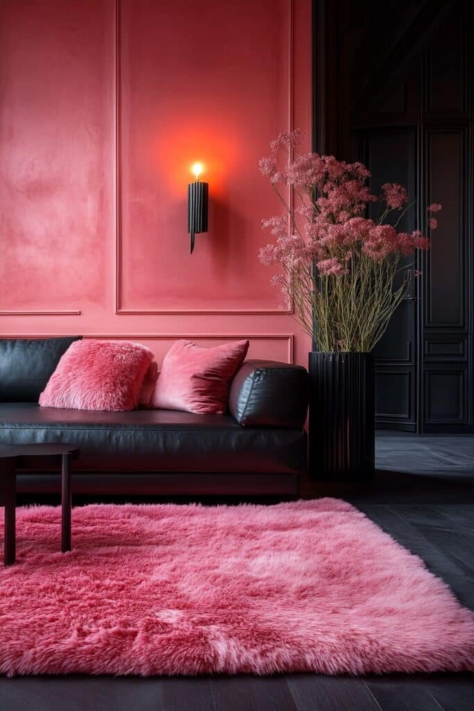
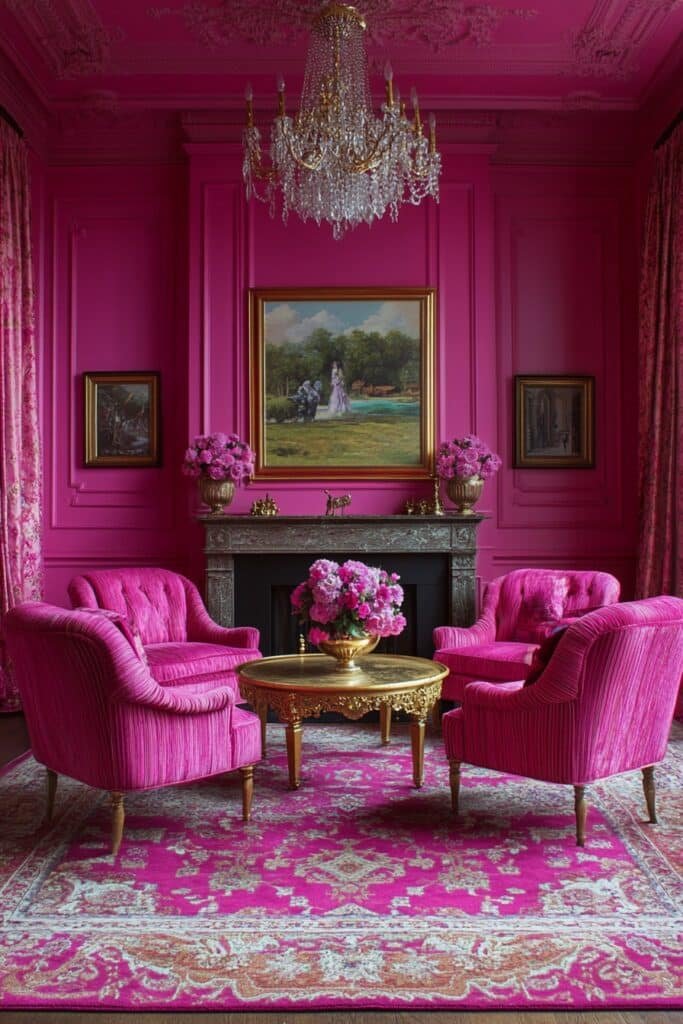
23. Dramatic Deep Pink
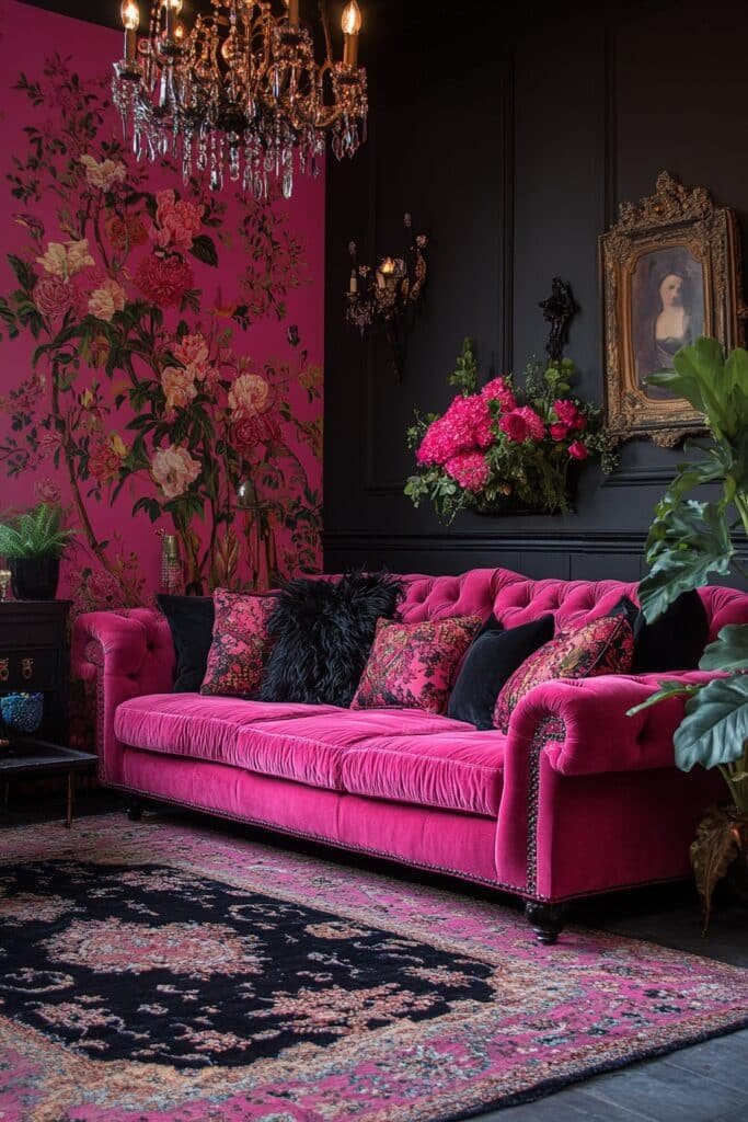
Dramatic Deep Pink uses rich pink tones and luxurious textures to create a bold, theatrical living room.
✎ Steal This Look
- Paint Color: Farrow & Ball Rangwali 296
- Furniture: velvet sofa in deep raspberry, brass-accented coffee table, lacquered sideboard
- Lighting: oversized brass chandelier with warm dimmable bulbs
- Materials: velvet, polished brass, lacquered wood, silk drapery
This is the pink for people who think they hate pink—moody, grown-up, and unapologetically bold. It reads more wine bar than nursery.
24. Breezy Pink Retreat
Breezy Pink Retreat uses light pink tones and airy fabrics to evoke an ocean breeze in a serene living room.
🖼 Steal This Look
- Paint Color: Behr Rose Water MQ3-38
- Furniture: slipcovered linen sofa in warm white, whitewashed wood coffee table, rattan accent chair
- Lighting: natural rattan pendant or linen drum shade floor lamp
- Materials: linen, rattan, bleached wood, sheer cotton curtains
This is the living room equivalent of a pink sand beach at 10am—soft, sun-drenched, and impossible to rush through.
🛒 Get The Look
25. Urban Pink Skyline
Urban Pink Skyline integrates pink tones with sleek furniture to complement city views, creating a vibrant and sophisticated living room.
🏠 Steal This Look
- Paint Color: Valspar Pink Ground 2002-3C
- Furniture: low-profile charcoal sectional with brushed metal legs, glass-top nesting coffee tables
- Lighting: linear LED pendant with black finish, slim arc floor lamp
- Materials: polished concrete, brushed nickel, velvet upholstery, tempered glass
This is for the city dweller who wants their space to feel intentional but not fussy—pink here reads confident, not precious, especially when the lights of downtown flicker on.
26. Berry Bliss Lounge
Berry Bliss Lounge infuses the living room with rich berry pink hues and plush furnishings for a luxurious and welcoming space.
🏠 Steal This Look
- Paint Color: PPG Berry Pink 2070-30
- Furniture: velvet berry-toned sofa, blush accent chair, brass-legged coffee table
- Lighting: warm brass sputnik chandelier with dimmable bulbs
- Materials: plush velvet, brushed brass, rich walnut wood, soft wool throws
This is the living room for someone who wants warmth without beige—it’s bold enough for evening cocktails yet soft enough for Sunday lounging.
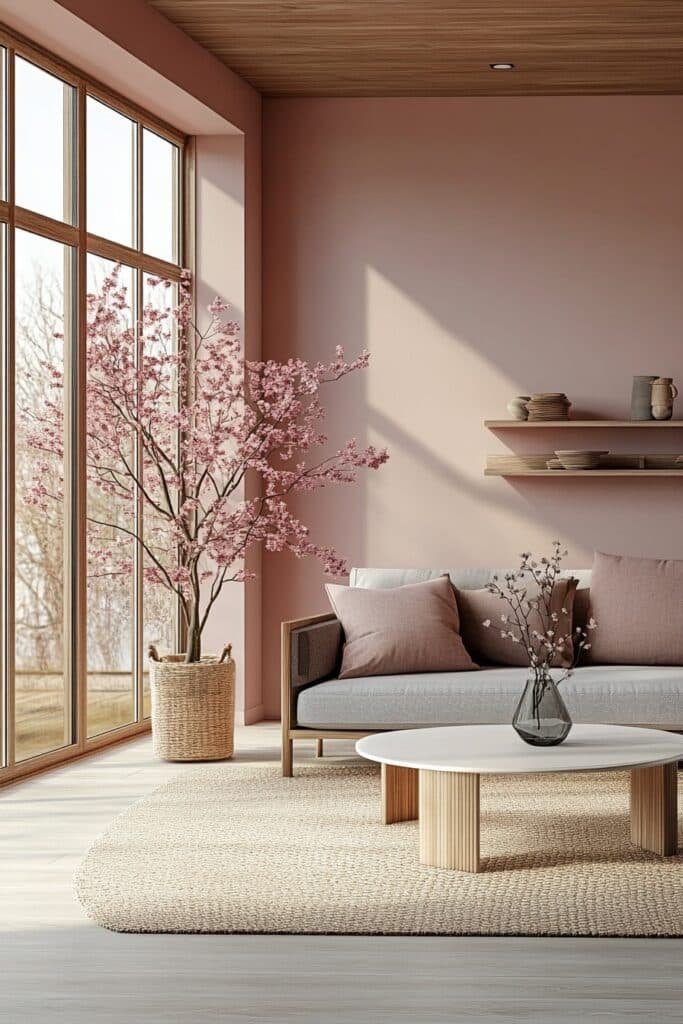
27. Peach Pink Serenity
Peach Pink Serenity blends peach-pink tones with soft patterns and natural wood accents for a tranquil living room retreat.
🎨 Steal This Look
- Paint Color: Dunn-Edwards Peach Bud DE5183
- Furniture: slipcovered linen sofa in warm ivory, natural oak coffee table with rounded edges, woven rattan accent chair
- Lighting: oversized linen drum pendant with brass hardware
- Materials: raw oak, Belgian linen, jute rug, subtle botanical prints, matte ceramic
This is the color of a slow Sunday morning—soft enough to live with, warm enough to feel wrapped in. I keep coming back to it for clients who want personality without the punch of a true pink.
28. Sapphire Pink Glam
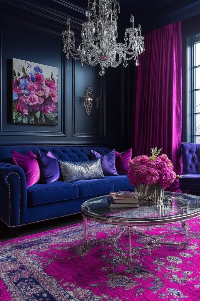
Sapphire Pink Glam highlights bold pink sapphire tones with gold accents and velvet furnishings for a regal, opulent living room.
★ Steal This Look
- Paint Color: Clare Paint Hot Mess 0027
- Furniture: deep pink velvet sofa with gold tapered legs, brass and glass nesting tables
- Lighting: crystal chandelier with gold finish, pink silk drum shade table lamps
- Materials: crushed velvet, polished brass, mirrored surfaces, marble accents
This is the living room equivalent of a power suit—unapologetically feminine yet commanding. The velvet practically demands you sink in with a negroni.
29. Champagne Pink Lounge
Champagne Pink Lounge uses light pink tones and shimmering accents to create a festive, chic living room perfect for entertaining.
🏠 Steal This Look
- Paint Color: Fine Paints of Europe ECO Champagne Pink ECO-42
- Furniture: ivory velvet sofa with channel tufting, rose gold and glass nesting tables, blush pink accent chair with brass legs
- Lighting: crystal chandelier with warm dimmable LEDs, rose gold floor lamp with white linen shade
- Materials: metallic champagne gold finishes, crushed velvet, mirrored surfaces, mother-of-pearl inlay, silk drapery
This is the living room that begs for a Friday night in with prosecco and close friends—the shimmer catches candlelight beautifully without trying too hard.
Conclusion
In conclusion, incorporating pink into your living room design is a fun and stylish way to brighten your space and add a playful twist. These 29 pink living room ideas show how versatile this color can be, whether you prefer a soft, romantic look or a bold, vibrant statement. With the right touches, pink can transform your living room into a space that’s both welcoming and full of personality. So, embrace the charm of pink and let your creativity shine!