Who says living rooms have to stick to neutral tones to look stylish? Adding color doesn’t mean turning your space into a chaotic rainbow—when done right, it can bring energy, personality, and a modern vibe to your home. Whether you love bold pops of color or prefer softer, playful hues, these colorful living room ideas will show you how to brighten up your space while keeping it chic and cheerful. Ready to trade beige for something a little more exciting? Let’s dive in and explore how color can transform your living room!
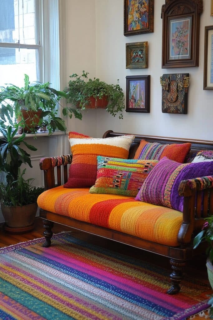
1. Rainbow Retreat Vibes

Rainbow Retreat Vibes highlights a full spectrum of colors for dynamic and playful colorful living room ideas.
🌟 Steal This Look
- Paint Color: Sherwin-Williams Tricorn Black SW 6258 for accent wall with Sherwin-Williams Alabaster SW 7008 for remaining walls to anchor rainbow accents
- Furniture: Mid-century modern sectional in neutral gray or cream; colorful accent chairs in jewel tones (emerald, sapphire, golden yellow); natural wood coffee table
- Lighting: Sculptural pendant lights in mixed warm metals; floor arc lamp with brass or copper finish to complement rainbow palette
- Materials: Velvet upholstery on accent seating, natural wood, glass surfaces, textured area rug in multi-color weave
Rainbow vibes don’t mean neon chaos—it’s about celebrating color with intention and joy. Think curated art collector, not craft store explosion.
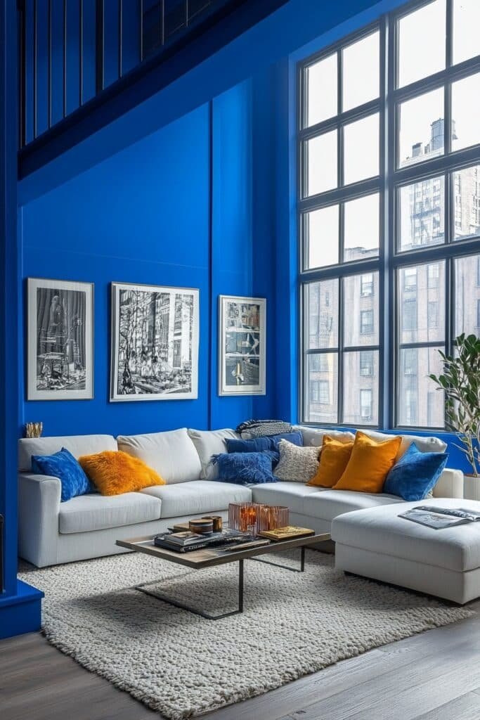
2. Bold Primary Palette
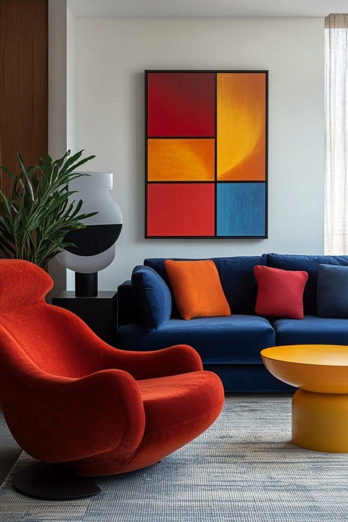
Bold Primary Palette uses red, blue, and yellow to energize and define living spaces.
🏠 Steal This Look
- Paint Color: Benjamin Moore Patriot Blue HC-156
- Furniture: Mid-century modern sectional in cream or gray linen to ground bold primary accents; wooden coffee table with clean lines
- Lighting: Brass or gold pendant fixtures with geometric shades to complement jewel-tone palette
- Materials: Mix matte and glossy finishes—flat finish on blue accent wall, lacquered side tables, natural wood elements
A bold primary palette transforms a living room into a confident, joy-filled gathering space that celebrates color without apology. This approach works beautifully in homes that embrace maximalism and playful, energizing environments.
3. Pastel Bliss Haven
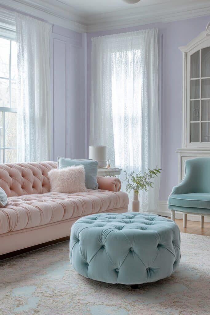
Pastel Bliss Haven creates a soothing, airy ambiance with soft pinks, blues, and greens.
✎ Steal This Look
- Paint Color: Farrow & Ball Calluna 270
- Furniture: Light oak or whitewashed wooden coffee table, cream linen sofa, pastel upholstered accent chairs in soft blush and sage
- Lighting: Brass or warm gold pendant lights with frosted glass shades, or a delicate crystal chandelier
- Materials: Soft cotton and linen textiles, natural wood, brushed brass hardware, matte ceramic accents
Pastel living rooms work beautifully when you treat them as grown-up sanctuaries rather than playrooms. The softness invites relaxation while the color prevents the space from feeling bland or sterile.
4. Neon Burst Lounge
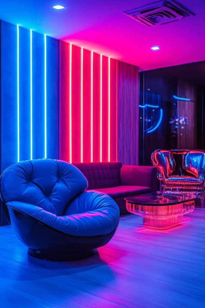
Neon Burst Lounge incorporates bold neon accents for a modern and lively living space.
🌟 Steal This Look
- Paint Color: Behr Blank Canvas N550-1
- Furniture: Low-profile modern sectional in charcoal gray or black leather; sleek glass coffee table; minimalist media console
- Lighting: LED neon tube lights in hot pink, electric blue, or lime green; track lighting with dimmer capability; modern floor lamp with geometric base
- Materials: Polished concrete or light wood flooring; matte black metal accents; glossy lacquered surfaces; soft area rug in neutral tone to ground neon pops
A neon burst lounge walks the line between edgy and livable—it’s perfect for creative professionals or anyone who wants their space to feel vibrant without sacrificing sophistication. The key is strategic placement so neon feels like curated art, not a nightclub.
5. Pop Art Inspiration
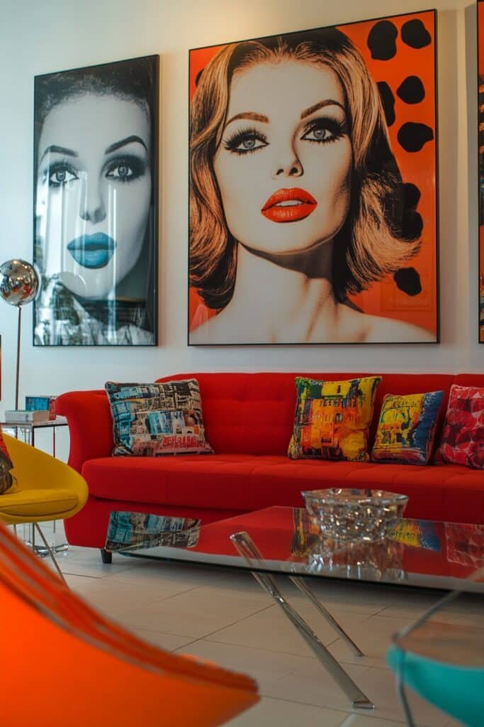
Pop Art Inspiration pairs graphic prints with vibrant hues to create an art lover’s colorful living room.
🎨 Steal This Look
- Paint Color: Valspar Borscht 8161
- Furniture: Mid-century modern sectional in charcoal gray or white with clean lines, paired with a black or natural wood coffee table to ground bold artwork
- Lighting: Geometric chrome or brass pendant lights with angular or spherical shapes—think Sputnik or modern geometric fixtures
- Materials: High-gloss lacquered surfaces, polished chrome, matte black metal frames for artwork, concrete or light wood flooring
Pop Art living rooms celebrate bold self-expression and visual energy. This style is perfect for collectors who view their home as a personal gallery, where graphic prints, vivid color, and retro-modern furnishings create an unapologetically artistic atmosphere.
6. Color Block Retreat
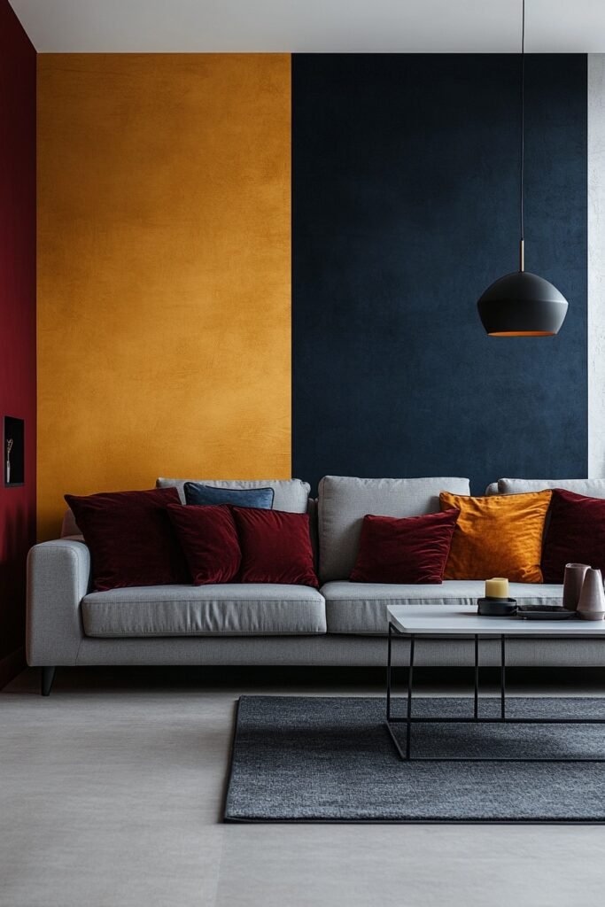
Color Block Retreat showcases solid color zones for a bold and harmonious look.
★ Steal This Look
- Paint Color: PPG Tricorn Black HC-204 for one accent wall; PPG Creamy White PP-1001 for remaining walls
- Furniture: Low-profile modern sofa in charcoal gray, geometric coffee table with mixed materials, sleek shelving unit in matte black
- Lighting: Linear track lighting with matte black fixtures for directional accent highlighting
- Materials: Matte finish paint, concrete or polished concrete accents, natural wood mixed with lacquered surfaces, wool area rug in neutral tone
Color blocking transforms a living room into a gallery-like space where each solid zone gets its moment to shine. It’s bold without pattern complexity, making the room feel curated and intentional.
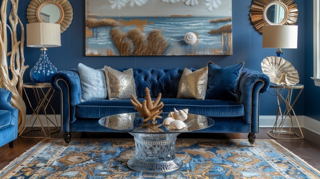
7. Jewel Tone Elegance
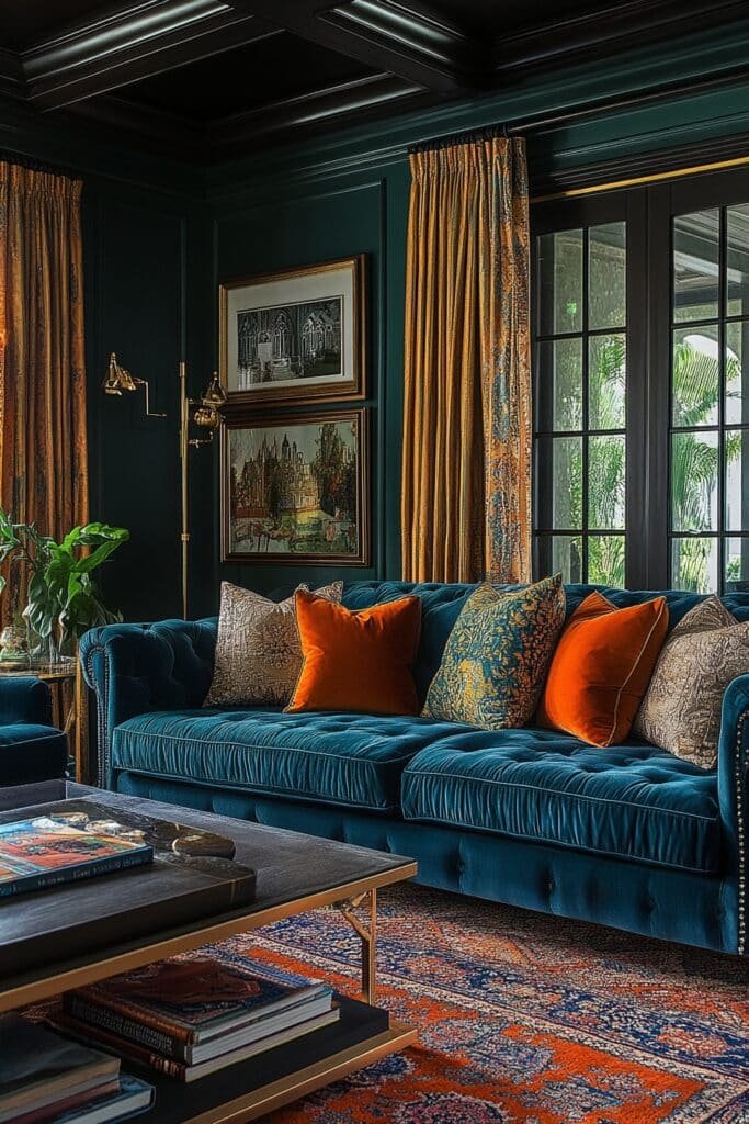
Jewel Tone Elegance features rich hues like emerald green and sapphire blue for a luxurious living room.
🏠 Steal This Look
- Paint Color: Dunn-Edwards Flourish DE6307
- Furniture: Jewel-tone velvet sofa in emerald or sapphire with brass-trimmed legs; rich wood side tables with warm patina; low-profile credenza in walnut or brass accents
- Lighting: Brass or gold chandelier with warm-toned bulbs; brass table lamps with jewel-toned fabric shades
- Materials: Plush velvet upholstery, brass hardware, warm wood finishes, marble or brass side table tops, rich wool area rugs
Jewel tone living rooms feel like stepping into a sophisticated, curated gallery—moody yet inviting. This approach works beautifully for those who crave drama and personality without sacrificing elegance.
8. Mediterranean Vibrance
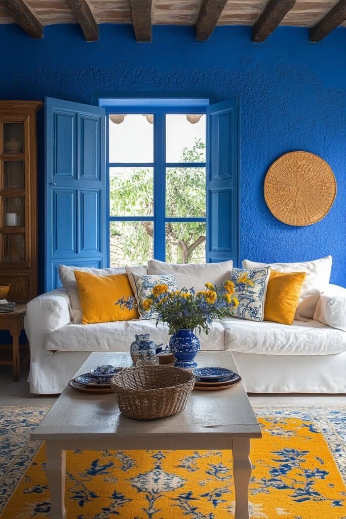
Mediterranean Vibrance uses sunny yellows and ocean blues to evoke Mediterranean landscapes.
🏠 Steal This Look
- Paint Color: Clare Paint Sunshine C001 for main walls with an accent wall in Clare Paint Mediterranean Blue M002
- Furniture: Natural wood dining table with wrought iron legs, upholstered chairs in cream linen, wooden shelving units, and a low-profile sofa in natural cotton
- Lighting: Wrought iron pendant lights with warm Edison bulbs, wall sconces with amber glass, and brass floor lamps for warm ambient glow
- Materials: Terracotta tile flooring, natural wood beams, whitewashed wood accents, linen upholstery, ceramic tile backsplash in Mediterranean blue patterns
Mediterranean Vibrance transforms your living room into a sun-drenched escape that feels both energetic and welcoming. This palette celebrates warmth and natural light while grounding the space with timeless coastal authenticity.
9. Cheerful Yellow Glow
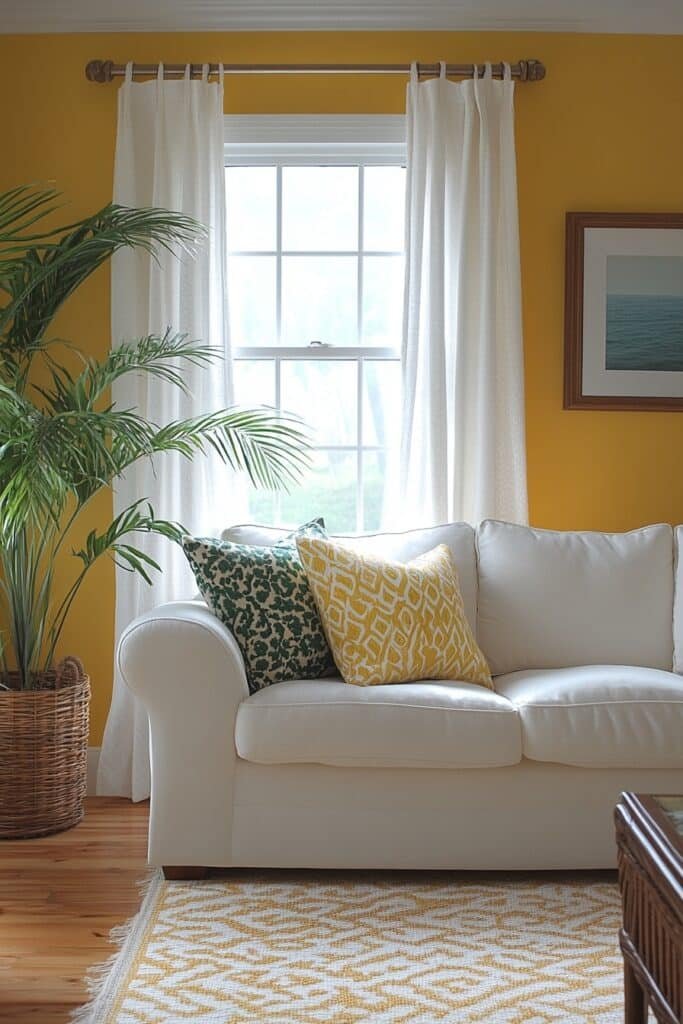
Cheerful Yellow Glow embraces sunny yellow tones to brighten any living space.
🏠 Steal This Look
- Paint Color: Fine Paints of Europe Sunburst Yellow 346
- Furniture: Light wood or natural oak sofa with clean lines, paired with cream or soft white accent chairs to balance the warmth
- Lighting: Brass or gold-toned pendant lights or a statement chandelier with warm-white LED bulbs (2700K)
- Materials: Natural linen upholstery, light wood frames, soft area rug in cream or pale gold, warm metallics
A sunny yellow living room instantly lifts the mood and creates an inviting, optimistic atmosphere that feels both modern and timeless. It’s the perfect choice if you want a space that feels like it’s perpetually bathed in natural light.
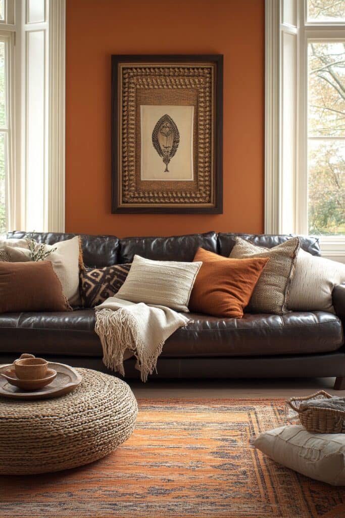
10. Vibrant Orange Flair
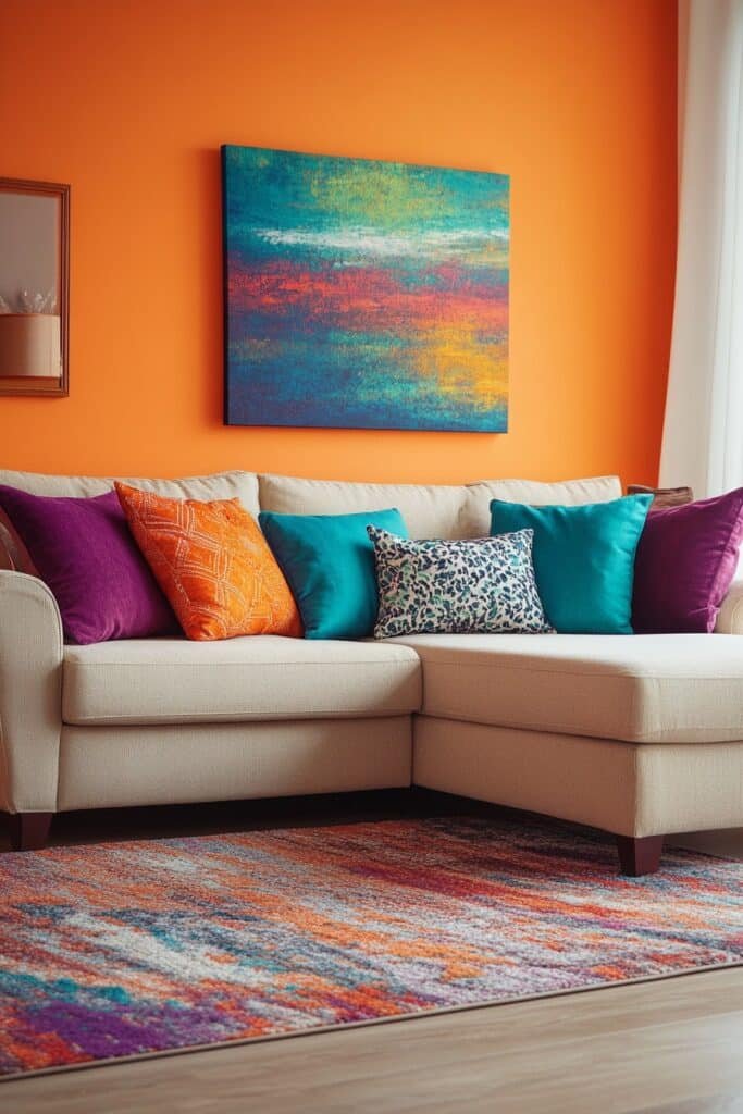
Vibrant Orange Flair integrates warm orange hues for a bold and energetic design.
💡 Steal This Look
- Paint Color: Backdrop Tangerine Dream BDR-247
- Furniture: Mid-century modern sectional in cream or warm gray linen to balance the bold orange walls; natural wood coffee table and side tables with warm honey tones
- Lighting: Brass or gold arc floor lamp with warm-toned linen shade to complement orange walls; pendant lights with brass fixtures
- Materials: Warm terracotta accents, natural wood, linen upholstery, woven jute rug, ceramic vases in complementary warm tones
A vibrant orange living room channels warmth and creativity without feeling chaotic—it’s bold enough to inspire conversation while staying grounded with neutral furnishings. This is perfect for homeowners who love color but want their space to feel intentional and inviting, not overwhelming.
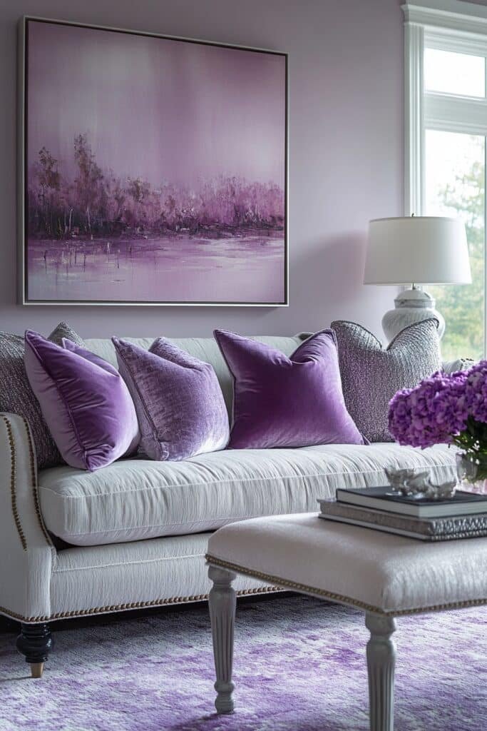
11. Purple Luxe Space
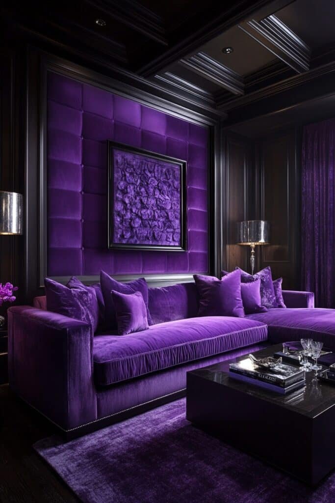
Purple Luxe Space uses deep purples paired with metallic accents for a regal atmosphere.
🏠 Steal This Look
- Paint Color: Sherwin-Williams Valiant Violet SW 6956
- Furniture: Velvet sectional sofa in deep plum, brass-legged accent chairs, marble-top side tables, jewel-toned ottoman
- Lighting: Crystal chandelier with brass or gold finials, paired with brass floor lamps with silk shades
- Materials: Velvet upholstery, marble, brass hardware, silk drapery, plush area rug in charcoal or deep gray
A purple luxe living room feels like your personal sanctuary—moody, sophisticated, and unapologetically bold. It’s the space where you unwind in style.
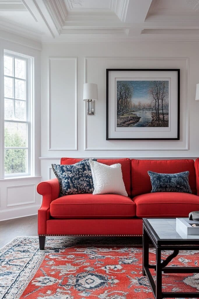
12. Red Energy Zone
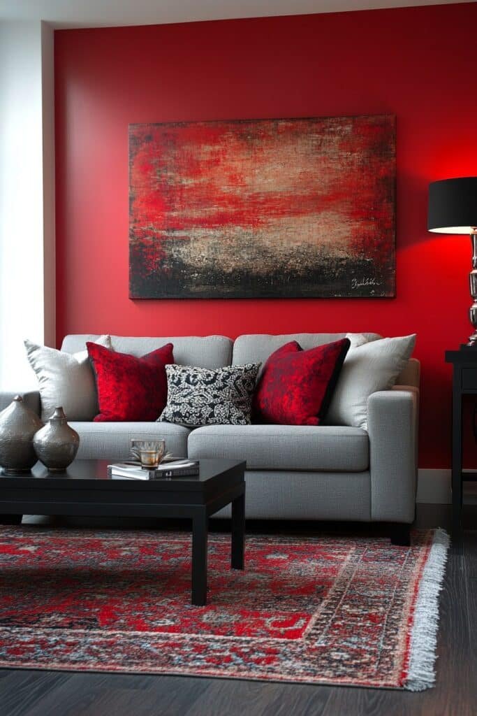
Red Energy Zone uses fiery reds to create a dynamic and inviting living room.
🎨 Steal This Look
- Paint Color: Benjamin Moore Caliente AF-290
- Furniture: Charcoal gray sectional sofa with clean lines, dark wood coffee table, black metal frame side tables
- Lighting: Matte black pendant lights or track lighting to balance the warm red tones
- Materials: Leather upholstery, matte finishes, dark wood, metal accents to ground the energy
A red energy zone works best in living rooms where you entertain and want to spark conversation—it’s bold without being reckless when balanced with grounding neutrals and strategic lighting.
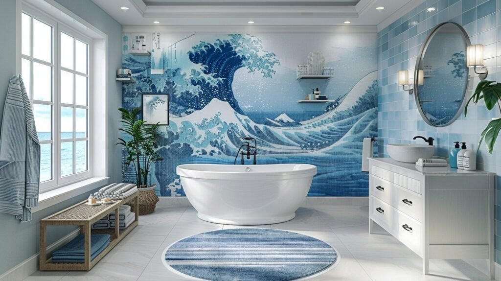
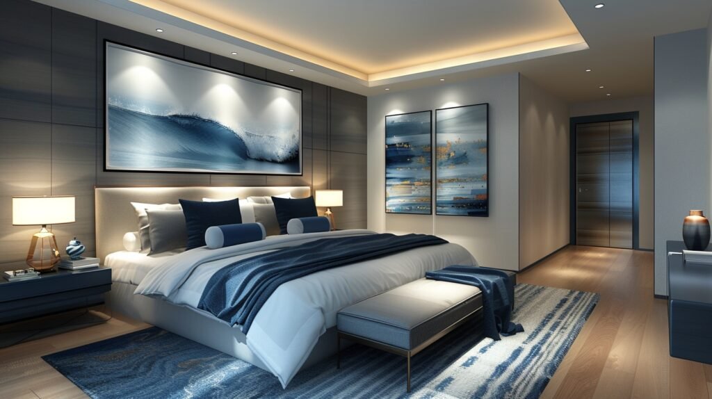
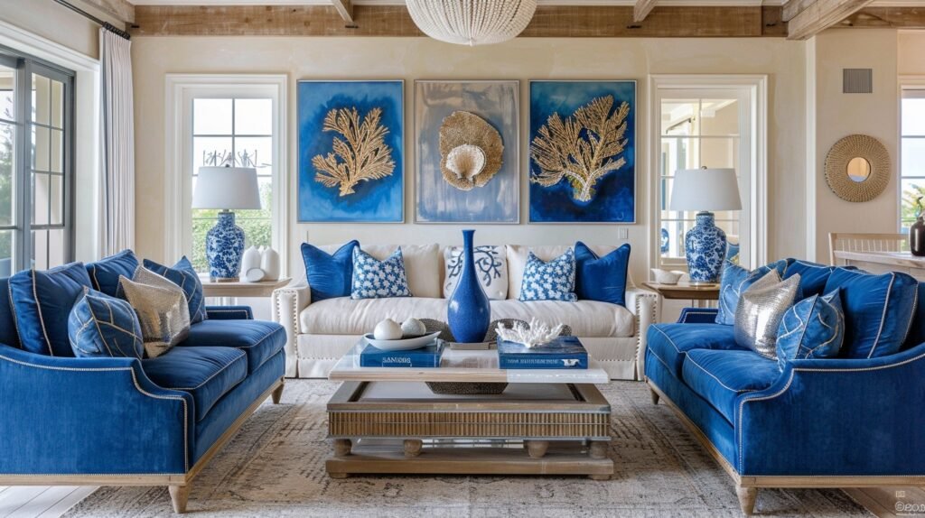
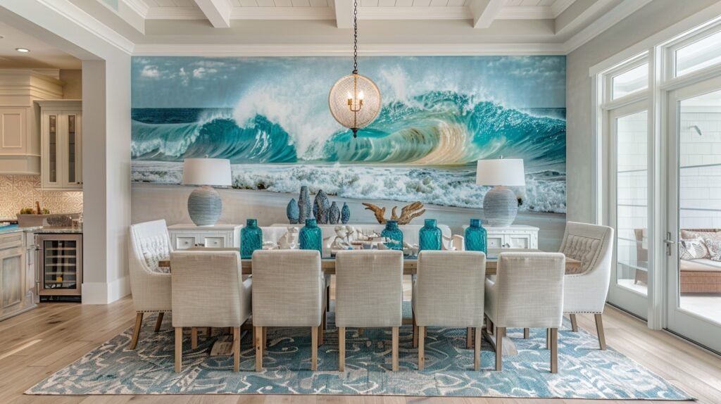
13. Ocean Blues Retreat
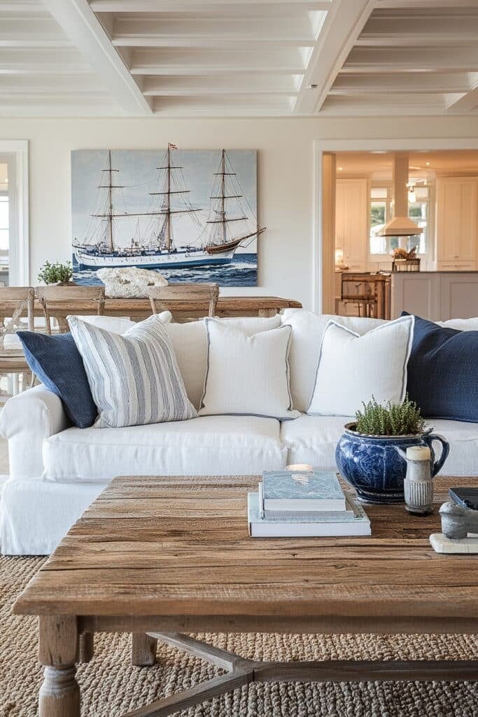
Ocean Blues Retreat incorporates calming shades of blue for a serene coastal vibe.
🖼 Steal This Look
- Paint Color: Farrow & Ball Borrowed Light 235
- Furniture: Light oak or whitewashed wood coffee table, upholstered coastal blue armchairs, natural linen sofa in cream or soft white
- Lighting: Brass or brushed gold wall sconces with frosted glass shades; pendant lights with woven natural fiber shades
- Materials: Natural linen, jute, light wood, sea-grass, weathered coastal wood accents, soft wool rugs in cream or pale blue
An ocean blues retreat is about creating a sanctuary that mimics the peaceful clarity of coastal air. This palette works beautifully in living rooms where you want guests to feel instantly relaxed the moment they enter.
14. Turquoise Peace Lounge
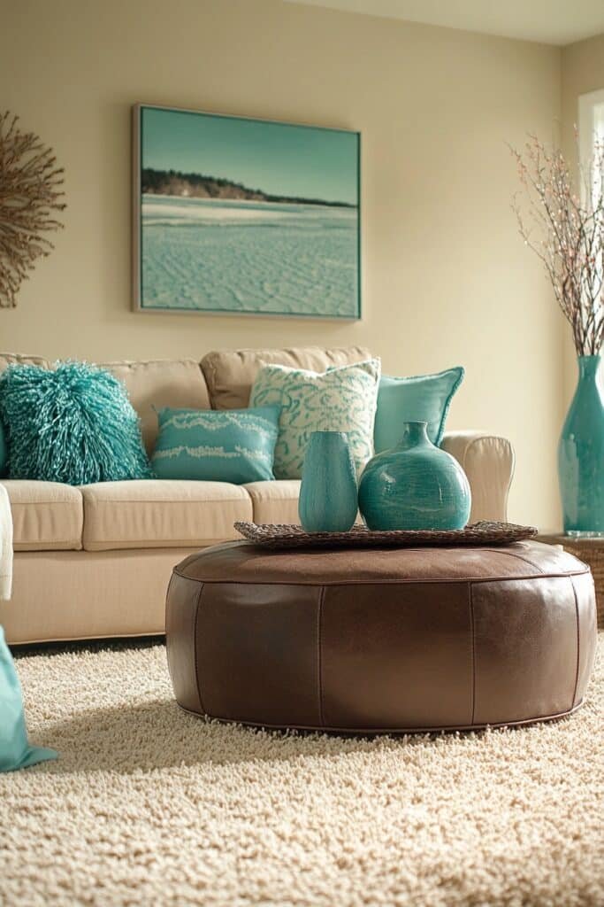
Turquoise Peace Lounge highlights soothing turquoise tones for a tranquil atmosphere.
🖼 Steal This Look
- Paint Color: Behr Turquoise Tone PPU13-16
- Furniture: Low-profile sectional sofa in cream linen, natural wood coffee table, woven rattan accent chairs, floating shelves in whitewashed wood
- Lighting: Soft pendant lights with frosted glass shades, floor arc lamp with warm dimmer capability
- Materials: Natural linen, rattan, light oak, soft area rug in cream or soft gray, jute accents
Turquoise is the color of calm water and open skies—it naturally invites relaxation without feeling cold. This palette works because it respects negative space and soft furnishings, letting the eye rest rather than jump between busy patterns.
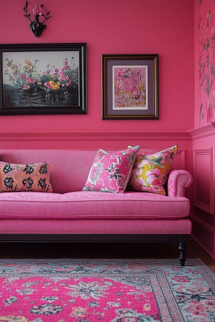
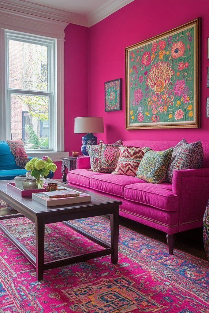
15. Magenta Mood Boost
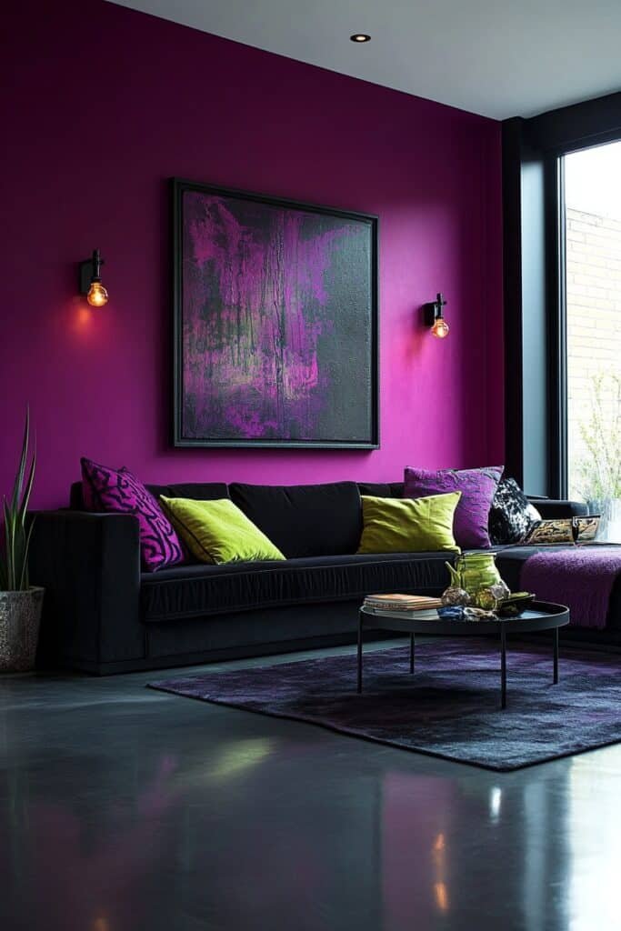
Magenta Mood Boost adds vibrancy and depth with bold magenta hues.
🏠 Steal This Look
- Paint Color: Valspar Vivid Magenta 8114-2
- Furniture: Mid-century modern sofa in charcoal gray or cream to ground the bold wall; low-profile coffee table in natural wood or black metal; accent chairs in jewel-tone velvet or neutral linen
- Lighting: Modern pendant lights with brass or matte black fixtures; floor lamp with warm white LED bulbs to balance magenta intensity
- Materials: Velvet upholstery for depth, matte finish paint to avoid overwhelming shine, natural wood accents, brushed metal hardware
Magenta is boldness translated to paint. It’s not for the timid, but in a living room, it signals confidence and creativity—especially when balanced with restraint elsewhere. This is the color choice of someone who isn’t afraid to make a statement.
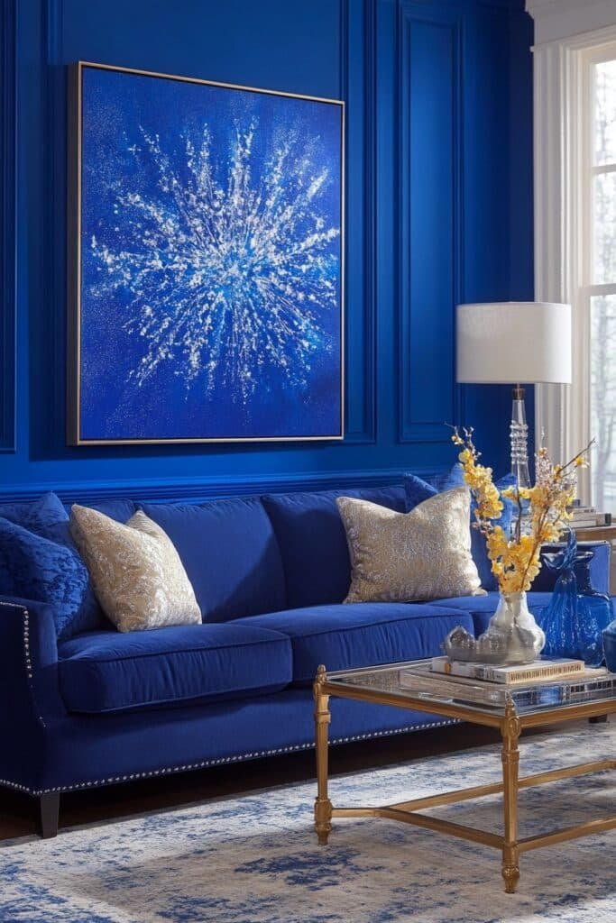
16. Electric Blue Style
Electric Blue Style uses striking blue shades for a bold, modern space.
★ Steal This Look
- Paint Color: PPG ColorName ELECTRIC BLUE 15-0755
- Furniture: Modern sectional sofa in charcoal gray or white to balance bold blue walls; sleek glass coffee table; minimalist media console in matte black or natural wood
- Lighting: Contemporary pendant lights with chrome or brushed nickel finishes; track lighting system for accent highlighting
- Materials: High-gloss or matte finish paint for depth; concrete, metal, and glass accents; modern upholstery in linen or performance fabric
Electric blue demands confidence and a commitment to modern minimalism. This isn’t a soft, cozy palette—it’s for those ready to make a room feel like a curated design statement that energizes every conversation.
17. Lavender Serenity
Lavender Serenity softens the space with gentle lavender tones for a relaxing vibe.
🌟 Steal This Look
- Paint Color: Dunn-Edwards Lilac Mist DE5982
- Furniture: Low-profile upholstered sofa in cream or soft gray linen; wooden coffee table with natural finish; plush area rug in neutral ivory or soft taupe
- Lighting: Soft brass or brushed gold floor lamp with linen shade; dimmable overhead fixture with warm white bulbs (2700K)
- Materials: Soft textiles (linen, cotton, wool blend); natural wood accents; matte finishes on walls and furniture
Lavender living rooms work best as personal retreats where soft color psychology naturally invites relaxation. This gentle hue pairs beautifully with minimalist furniture and creates a spa-like sanctuary right in your home.
18. Golden Glam Space
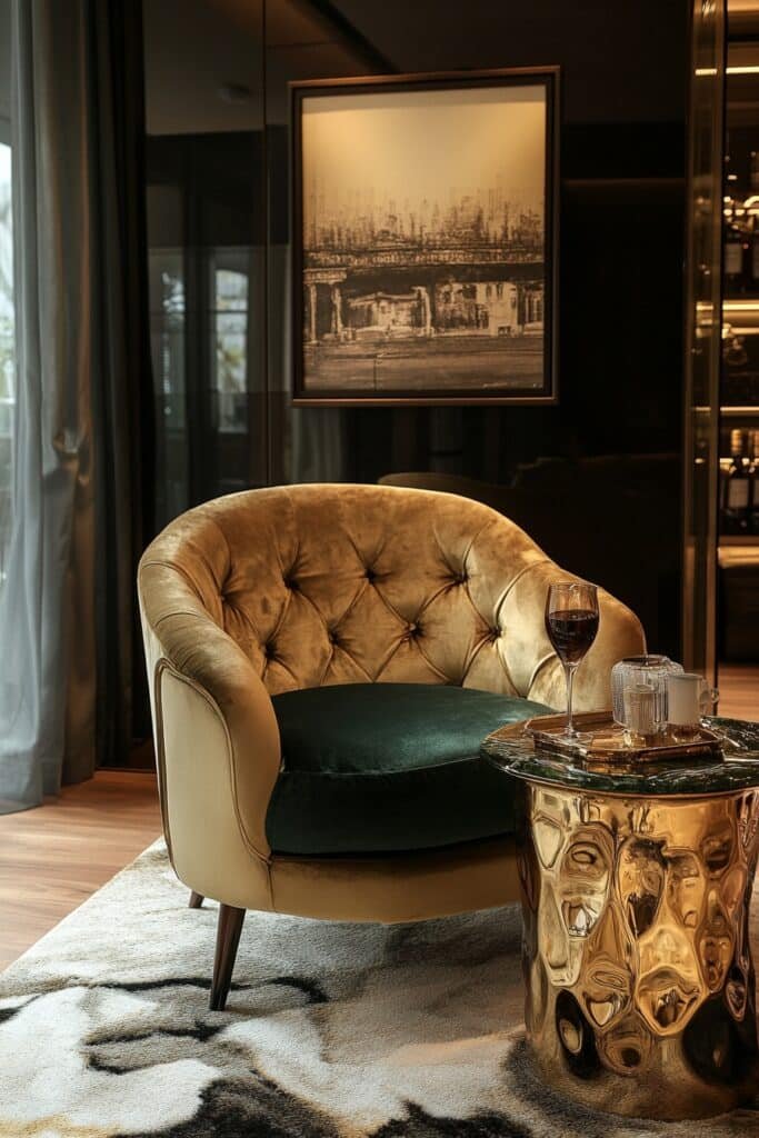
Golden Glam Space integrates warm golden tones for a luxurious and welcoming design.
✎ Steal This Look
- Paint Color: Clare Paint Warm Gold WG-340
- Furniture: Velvet sectional sofa in champagne or blush, brass-legged coffee table, mirrored console table, gold-framed accent chairs
- Lighting: Crystal chandelier with brass or gold accents, brass wall sconces with warm LED bulbs
- Materials: Velvet, marble, brass, gold leaf accents, plush area rug in cream or soft gray
A golden glam space whispers sophistication while staying warm and inviting. It’s the perfect balance of high-end drama and lived-in comfort—glamorous without being cold.
19. Green Vitality Room
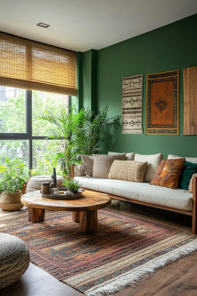
Green Vitality Room showcases lush green hues for a vibrant connection to nature.
🌟 Steal This Look
- Paint Color: Fine Paints of Europe Farrow & Ball No. 80 Mizzle (soft sage green) or No. 85 Breakfast Room Green (deeper forest tone)
- Furniture: Natural wood mid-century modern pieces with clean lines—green upholstered accent chairs, a light oak or walnut media console, and a low-profile sectional in cream or natural linen
- Lighting: Brass or wooden arc floor lamp with linen shade; pendant lights with natural wood details or rattan shades
- Materials: Raw wood finishes, linen fabrics, potted plants (real fiddle leaf figs, monstera, snake plants), woven jute rugs, stone or concrete accents
A green vitality room feels like your own peaceful retreat—it’s calming yet energizing, grounding you without shutting out the world. This palette works beautifully for living rooms where you want to unwind while feeling connected to nature.
20. Rustic Orange Charm
Rustic Orange Charm incorporates earthy orange tones for a cozy and grounded design.
🎨 Steal This Look
- Paint Color: Backdrop Terracotta Warmth TW-445
- Furniture: Reclaimed wood coffee table, chunky leather armchair in cognac brown, vintage-style wooden shelving, distressed wooden side tables
- Lighting: Edison bulb pendant lights with wrought iron fixtures, warm brass table lamps with linen shades
- Materials: Raw wood, aged leather, wrought iron, linen, clay pottery, woven jute rugs
Rustic orange creates warmth without feeling trendy—it’s the color of sunset on terracotta, of autumn leaves, of clay fired in kilns. This palette grounds a living room in comfort and story.
21. Cool Cobalt Hub
Cool Cobalt Hub uses cobalt blue for a bold and sophisticated look.
🖼 Steal This Look
- Paint Color: Sherwin-Williams Cobalt Blue SW 6802
- Furniture: White or cream upholstered sofa, natural wood coffee table, navy or white accent chairs, brass or gold metal side tables
- Lighting: Modern brass or gold pendant lights, or a contemporary floor lamp with white linen shade
- Materials: Linen upholstery, natural wood, brass accents, white marble or light wood side tables, wool area rug in cream or light gray
Cobalt blue is the ultimate power move for living rooms—it’s confident without being cold when balanced with warm metallics and bright whites. This palette says you’re intentional about color and aren’t afraid to make a design statement.
22. Coral Comfort Nook
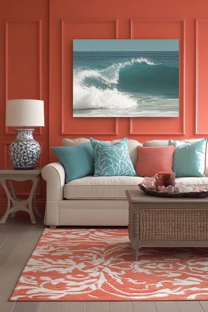
Coral Comfort Nook brightens the space with warm coral hues, creating a cozy ambiance.
🎨 Steal This Look
- Paint Color: Benjamin Moore Coral Sunrise HC-46
- Furniture: Low-profile upholstered armchair with rolled arms in cream linen, paired with a natural wood side table and woven jute poufs
- Lighting: Warm brass arc floor lamp with linen shade, positioned behind seating for ambient glow
- Materials: Soft coral walls, cream upholstery, natural wood accents, jute and rattan textures, plush area rug in warm neutral tone
A coral comfort nook invites you to sink in and stay awhile. This warm, embracing palette transforms a corner into your personal retreat—perfect for reading, daydreaming, or simply unwinding.
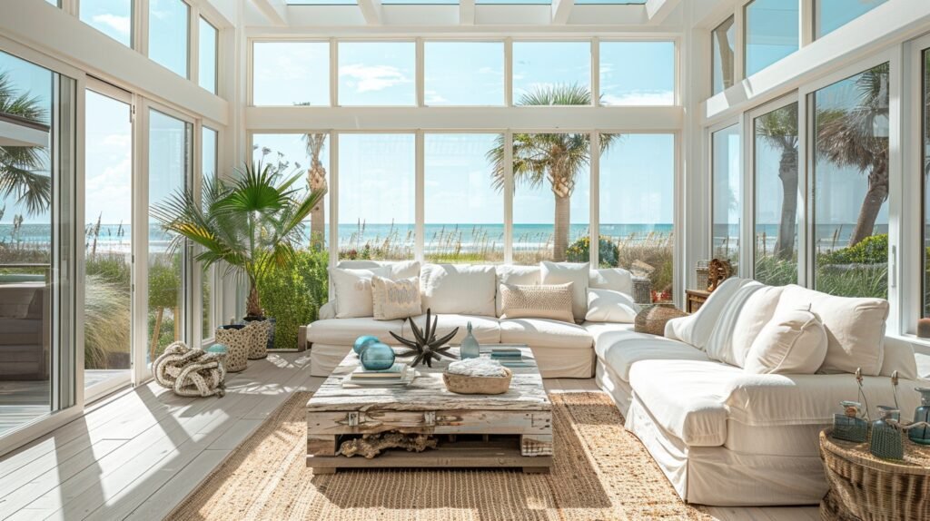
23. Aqua Tropic Lounge
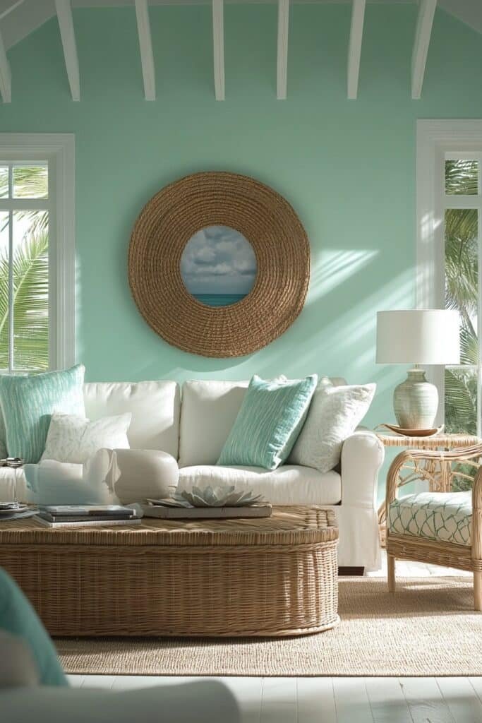
Aqua Tropic Lounge highlights aqua tones for a refreshing, tropical-inspired design.
✎ Steal This Look
- Paint Color: Farrow & Ball Blue Ground 210
- Furniture: Rattan or woven lounge chairs, light wood coffee table, linen upholstered sofa in cream or soft white, natural fiber poufs
- Lighting: Woven pendant lights or rattan-textured fixtures with warm brass accents
- Materials: Natural rattan, woven jute, linen, light wood, seagrass, ceramic accents in coastal blues
Aqua Tropic Lounge captures that dreamy resort feeling without requiring a passport. It’s the perfect escape-hatch design when your living room needs to breathe.
24. Peppy Pink Zone
Peppy Pink Zone energizes the space with bold pink tones for a playful aesthetic.
🌟 Steal This Look
- Paint Color: Behr Pink Damask HDC-MD-05
- Furniture: White or light natural wood media console, pink upholstered accent chair, white shelving unit, light gray sofa as neutral anchor
- Lighting: Brass or gold-finished pendant lights with white shades, dimmable ceiling fixture for playful ambiance control
- Materials: Soft velvet upholstery, natural wood accents, white lacquer finishes, light area rug in blush or cream
A peppy pink living room celebrates color confidence without sacrificing sophistication—it’s playful energy balanced by crisp whites and natural wood that keep the look fresh and livable.
25. Classic Red & White Mix
Classic Red & White Mix pairs vibrant reds with crisp whites for a timeless design.
🏠 Steal This Look
- Paint Color: Valspar Borscht Red 7002-10 for accent wall; Valspar Powder White 7001-1 for remaining walls
- Furniture: White upholstered sofa with red throw pillows, natural wood coffee table, white shelving units with red decorative objects and books
- Lighting: Chrome or brushed nickel pendant lights or track lighting to keep the look crisp and modern
- Materials: Crisp cotton linens, polished wood, clean-lined metal accents, white ceramics with red geometric patterns
Red and white is a surprisingly sophisticated combination when executed with restraint. This pairing works best when the white dominates and red serves as a bold, deliberate accent that adds energy without overwhelming the room.
26. Teal Tranquility Area
Teal Tranquility Area uses calming teal tones for a peaceful, stylish retreat.
🖼 Steal This Look
- Paint Color: PPG ColorName 5005-3C Teal Whisper
- Furniture: Neutral upholstered sofa in cream or soft gray, wooden coffee table in natural or whitewashed finish, modern accent chair in complementary teal or charcoal
- Lighting: Brushed brass or matte black pendant lights with warm LED bulbs, floor lamp with linen shade for layered ambient lighting
- Materials: Soft cotton and linen upholstery, natural wood tones, wool area rug in cream or soft gray, metal accents in brass or matte black
Teal is the perfect choice for a living room where you actually want to relax—it’s sophisticated enough for entertaining but calming enough to be your sanctuary. This palette creates that high-end resort feeling without any fuss.
27. Hot Pink Harmony
Hot Pink Harmony balances bold hot pink with neutral accents for a vibrant and chic design.
🌟 Steal This Look
- Paint Color: Dunn-Edwards Fiesta Pink DE5062
- Furniture: White or cream upholstered sofa, natural wood coffee table, light gray accent chairs, white media console
- Lighting: Chrome or brushed nickel pendant lights, modern floor lamp with white or natural wood base
- Materials: Soft cotton and linen upholstery, natural wood finishes, polished metal accents, light gray area rug
Hot pink harmony is for the confident decorator who wants personality without chaos. This approach celebrates color while respecting the need for breathing room and visual calm.
28. Rainbow Accent Fusion
Rainbow Accent Fusion incorporates multicolored patterns for a lively, eclectic living room.
🌟 Steal This Look
- Paint Color: Clare Paint Limestone CODE-C0143
- Furniture: Neutral-toned sectional sofa in cream or soft gray linen with jewel-tone accent chairs (emerald, sapphire, mustard) and a natural wood coffee table
- Lighting: Pendant lights with mixed-metal finishes or a statement chandelier with colored glass elements to echo the rainbow theme
- Materials: Woven jute area rug, velvet upholstery on accent pieces, natural wood accents, geometric patterned textiles in multi-color
Rainbow fusion works when it feels collected and curated, not costume-y. Think gallery walls with colorful art, layered patterned throws, and intentional color blocking through furniture rather than a ‘Roy G. Biv’ approach.
29. Neutral Bright Mix
Neutral Bright Mix combines beige tones with bold accents for a balanced yet colorful space.
💡 Steal This Look
- Paint Color: Fine Paints of Europe Farrow & Ball Old White 4
- Furniture: Cream linen sofa with natural wood frame, light oak coffee table, neutral upholstered accent chairs
- Lighting: Brass or brushed gold floor lamp with warm white LED bulbs, pendant lights with natural linen shades
- Materials: Linen upholstery, natural wood, soft wool area rug in cream or light gray, brass or wood accents
This approach gives you the serene anchor of neutrals while letting you experiment fearlessly with color through pillows, art, and accessories—perfect if you love evolving your style seasonally without repainting.
Conclusion
In conclusion, embracing color is the perfect way to bring life, energy, and personality into your home. With these colorful living room ideas, you can create a space that feels modern, cheerful, and uniquely yours. Whether you choose bold accents, vibrant walls, or subtle pops of color, there’s no limit to how you can transform your living room. So, don’t shy away from experimenting—add a splash of color and make your living room the most exciting room in the house!